Council spend map
I scraped 107 million rows of council spending data and built an ‘Apple Maps’ to see what each council in England spent, on what. All of the data is publicly available, but not easy to find or format.
Where it started
Riley Walz makes sites out of live public data. I wanted to know what we have in the UK:
what publicly available data is there in the uk where a site for live tracking the data in an easy interface would be really helpful/interesting or useful for a lot of people
I liked five of them: what’s opening and closing nearby, restaurant inspections, planning applications, what illness is going around, and where public money is going. So:
nah keep them all separate. create a new thread for each build and kick them all off. don’t have them do 3 design versions first. where visuals help like a map, include one, clear easy to read data.
Normally I’d want three versions (Prototyping). Not here. I didn’t want three versions of five ideas. I wanted to see which idea was worth it.
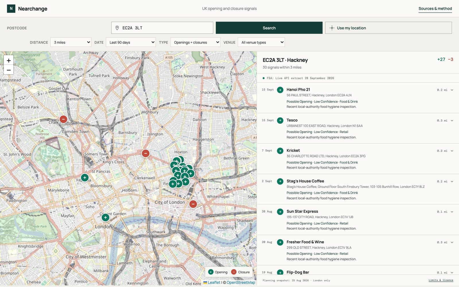
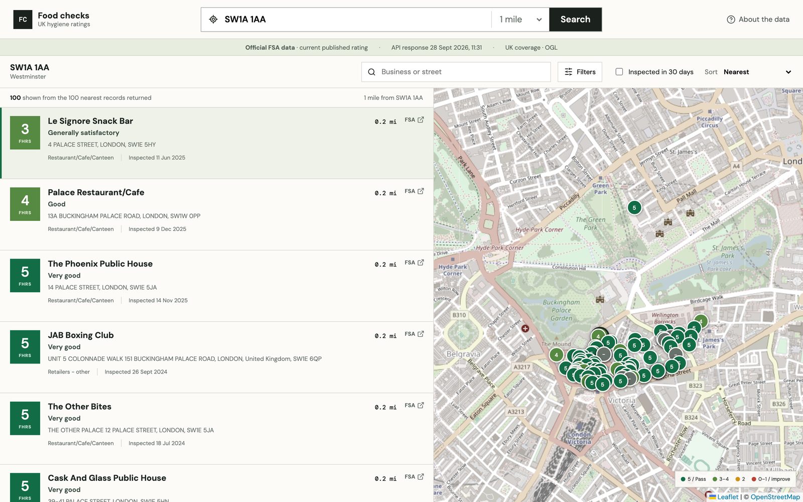
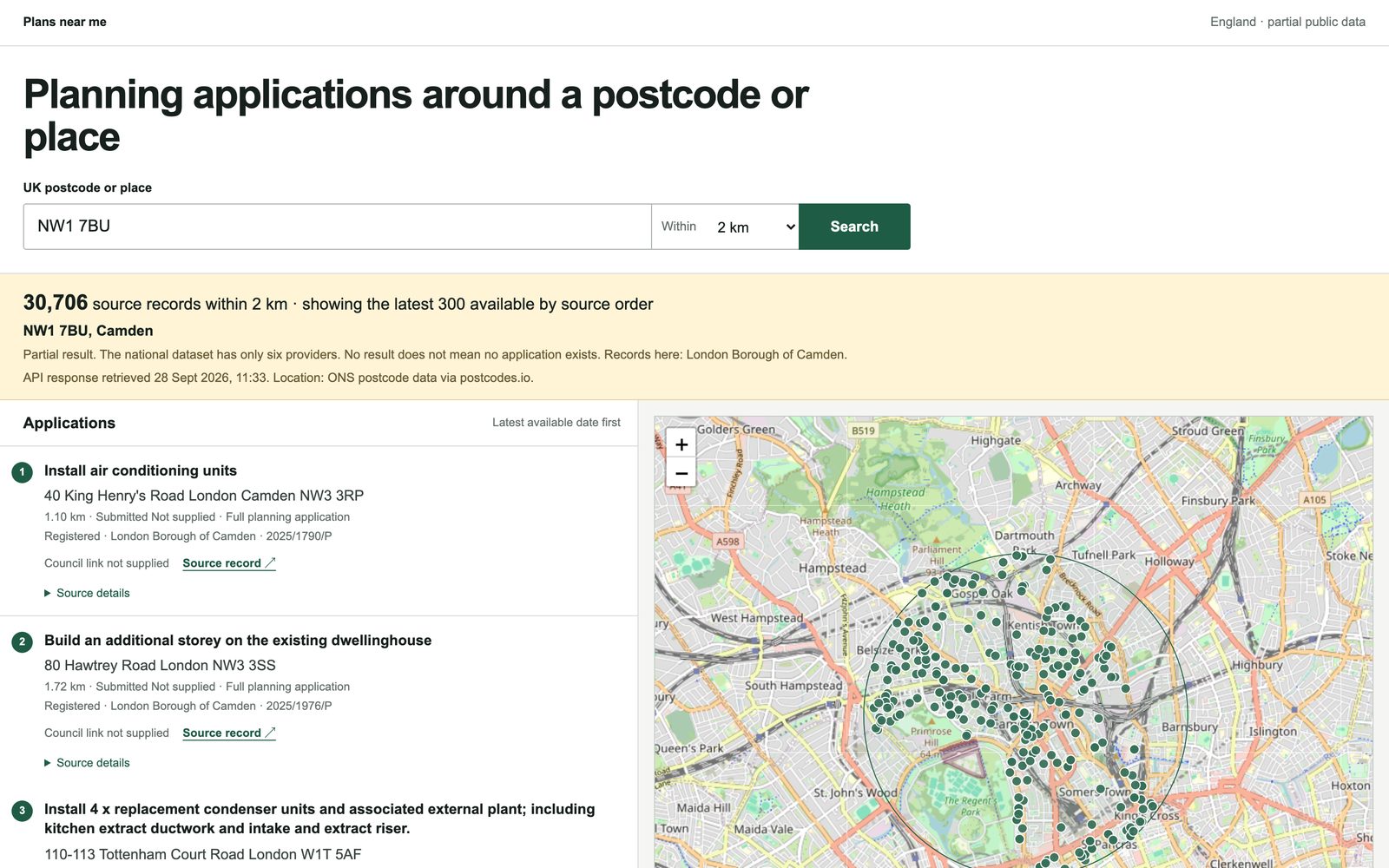
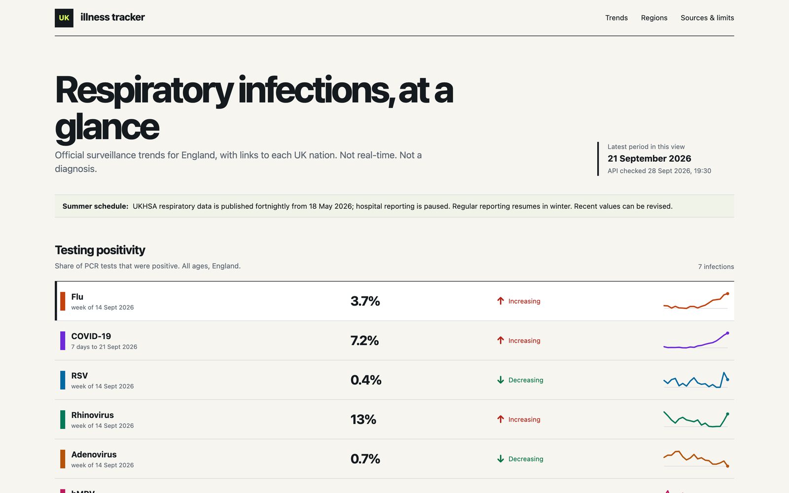
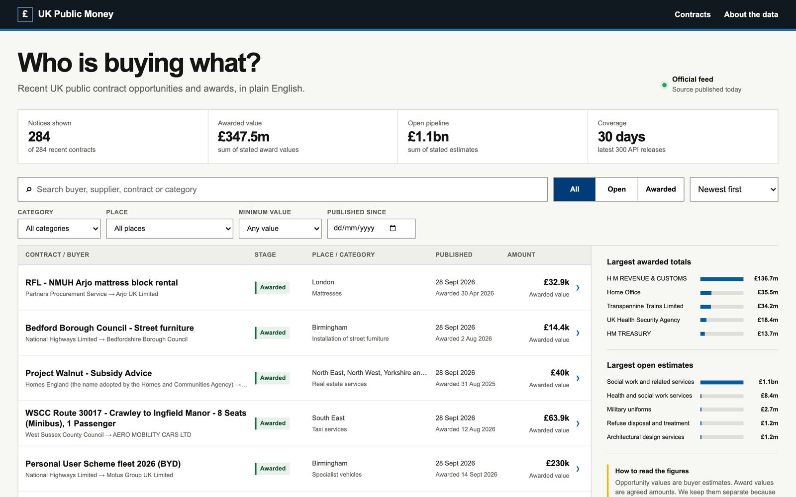
The public money one was government contracts. The next day I asked a different question and council spending came out of it (Working with data). Every council in England has to publish what it pays out over £500.
A receipt
I live in Bedfordshire, so I asked it to pull that in too. Bedfordshire turned out to be three councils: Bedford, Central Bedfordshire and Luton. With eight councils in, I wanted to see it. One of the ideas was a receipt: a council’s month of spending, printed out like a till roll.
i like tge receipt ida. build it
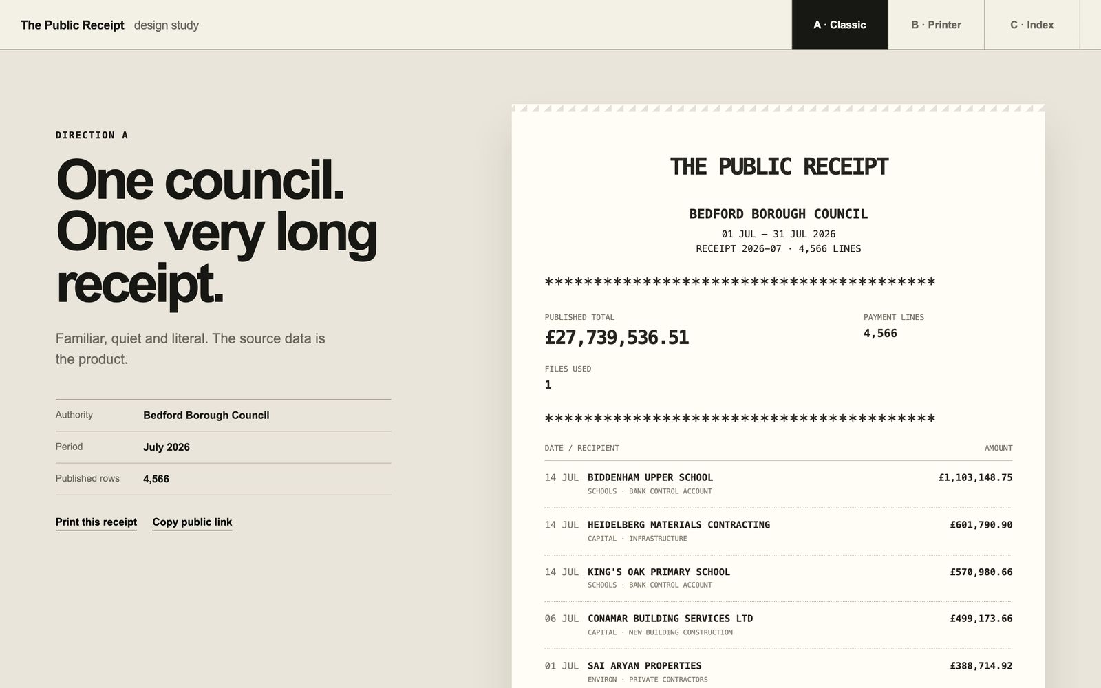
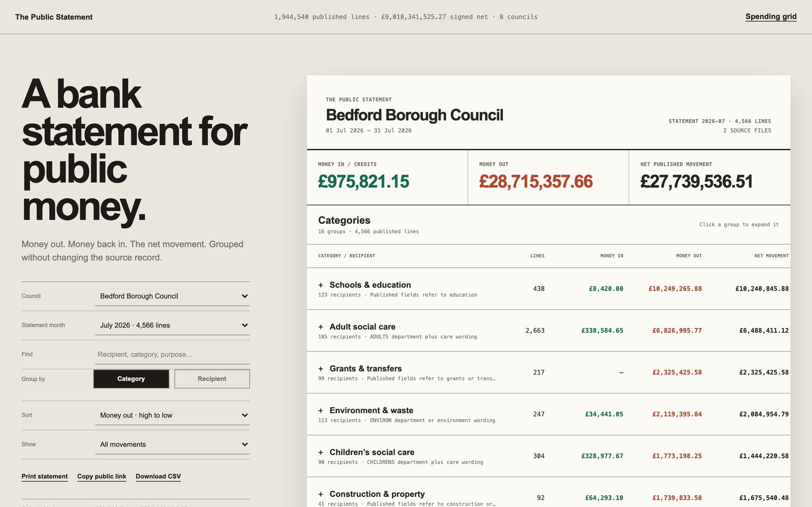
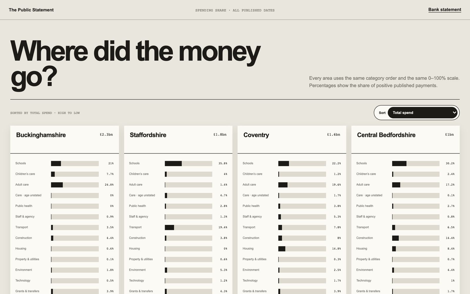
Then I wanted money in vs money out, like a bank statement rather than a receipt. Then a grid, a county in each cell, with a bar for each kind of spending. Each one went straight onto here.now so I could click through the real thing instead of screenshots.
The grid showed me how much was sitting in ‘other’. And eight councils looked good. So:
we have lots of good data, i want full coverage of england and wales.
Too much data
I left the design stuff to the side and thought about all the data I’d need. I use a MacBook Air, so I don’t want a ton of spreadsheets sitting there. But I have a Mac Mini.
I just want to focus on the data side of things. So data foundation, full coverage, quality and comparability. Product-wise, we don't need any of that stuff. […] I don't really work with a lot of data projects, so I don't really understand what it's like to work with data. We're ingesting a bunch of data. That seems like it's taking up a lot of space. It seems like it's going to take a long time to collect the data, clean the data, and then query the data. I've got a Mac Mini. Is that helpful in any way? Because this is just my MacBook Air. Are there going to be issues? Any of that kind of stuff? We've basically got an extra machine with a lot of space on it, a lot of memory and CPU that we can use.
Codex’s answer was Parquet and DuckDB, both of which I’d never heard of. Parquet stores the data in columns so a question only reads the bits it needs. DuckDB is a database that lives in a single file and is quick with big tables.
Codex set up the Mac Mini, Parquet and DuckDB, and tested it. At that point I had 78 councils and 34 million rows. There are 339 councils in England and Wales.
The data loop
Setup done, so I set Codex running on one goal. Find every council’s spending page, download everything, flatten it all into the same shape, have a second agent check the numbers, and load it into the database on the Mini.
monitor and keep collecting remaining. set a goal i want full data ingested for all councils we can. luna threads no permission issues, i approve actions.
It’s a subagent loop (Talking to agents). The Codex thread with the goal hands out batches of councils to Luna threads, and keeps going until there’s nothing left to collect:
It ran for nearly 2 days straight. I kept pushing it to go faster. It was keeping 100GB of the Mini free, which was way too much, so I told it 30 would do. Then:
we have to speed up this whole process, we're on about 3 councils an hour. how do we get 10 an hour? we must be able to make this much faster and efficient.
552 threads later, we had 319 out of 339 councils collected or in a parked state: no data, or no way to get the data. And I later found out Wales doesn’t have the same mandate as England in terms of spend reporting, so eventually I dropped Wales councils.
Google, then Apple
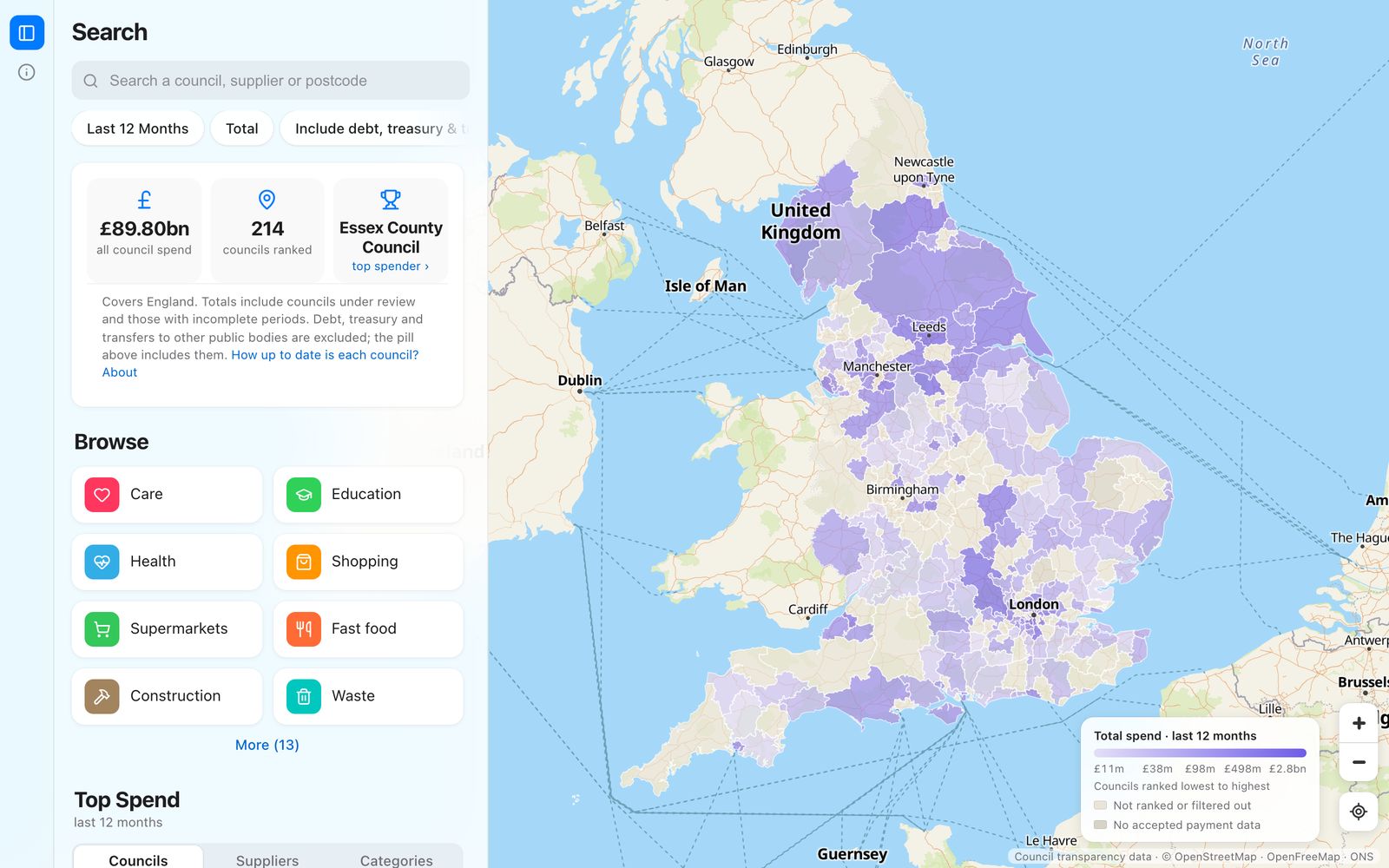
Data acquired, time to prototype again. I had a few agents building at once from the same prompt (Prototyping). One of the options was a map. It felt much better for seeing everything at once. So:
i want to build a site like maps.google.com
the data powering the map will be each england/wales council authorities spend data - how much they spend and where they spend it. it includes categories like schools/care/techn/staff/etc and also suppliers like amazon, argos, currys etc.
i want the map view, with zoom and panning. councils need borders.
i want the filters at the top and search pills. maps have 'restaurants', hotels etc - we can do the same and figure out our categories to show, when you click one of those it shows a list view on the left and the pills at the top change to show filtering options. this is how i want ours to work too.
build a mock data prototype and put on here.now
The first one was so basic looking and shit. I had it deleted and rebuilt, then did a few voice notes on the filters. It was fine. I could’ve kept going with it. But I also wanted to see an Apple Maps version:
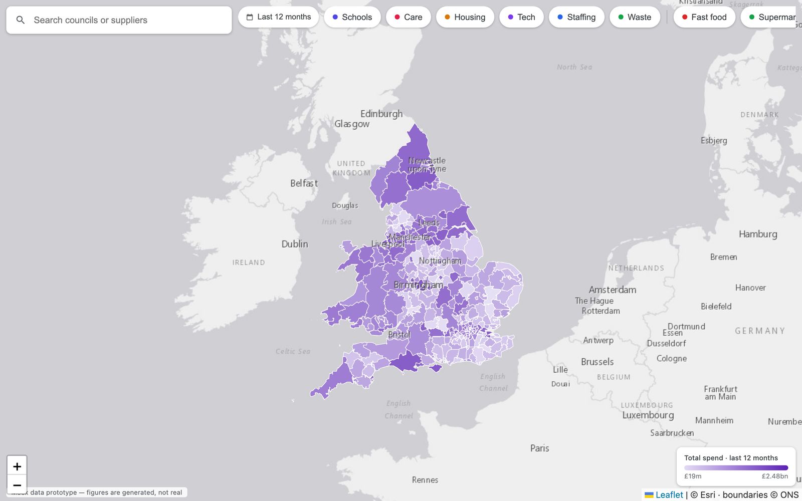
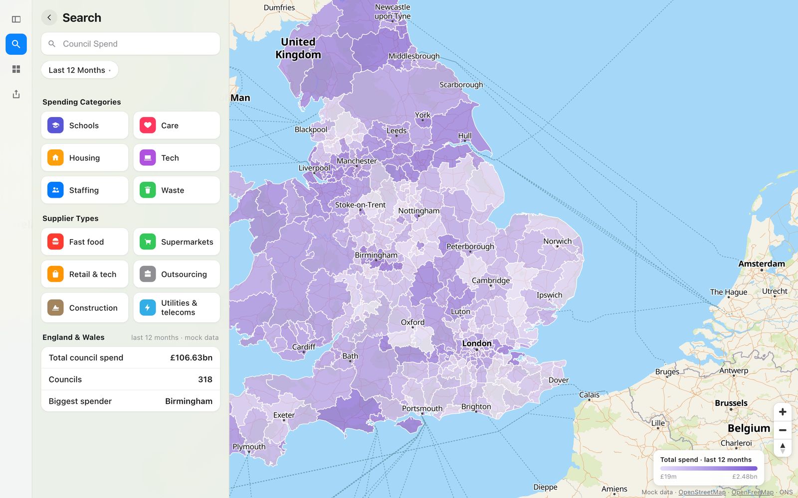
Apple felt much better. The panel on the left has room for the list and the numbers, and the map keeps the rest of the screen.
Both of these are mock data. I’m more often asking for mock prototypes before building these days, to get the look right first.
For the Apple one, I took some screenshots of Apple Maps:
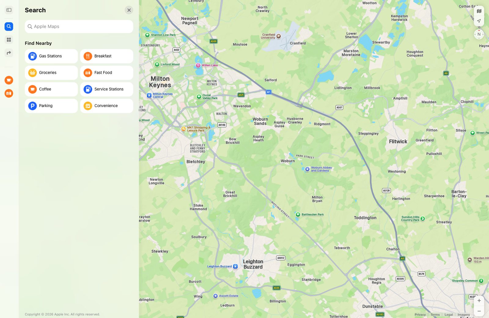
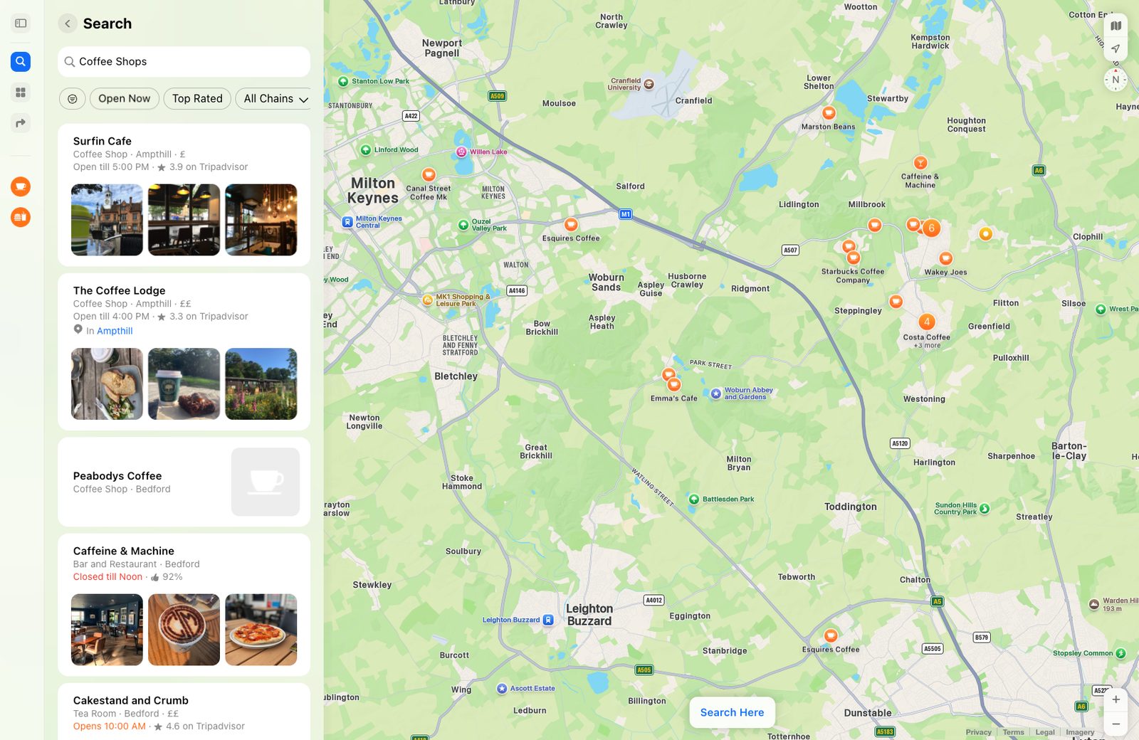
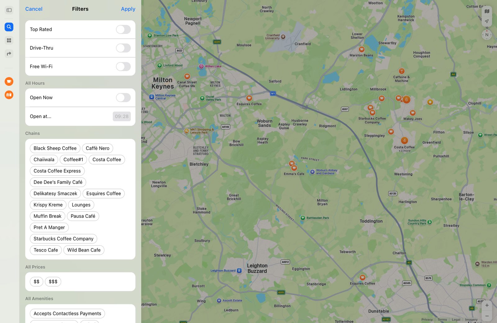
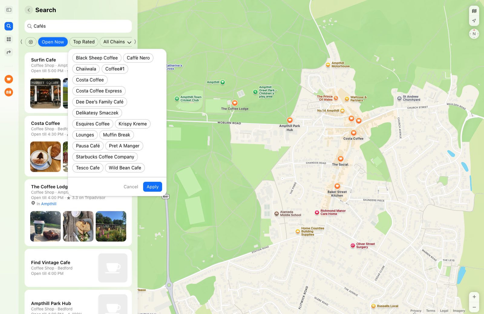
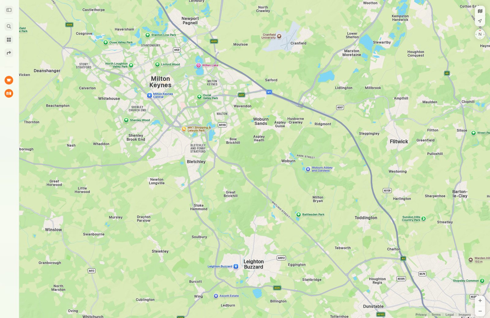
And gave them to it:
look at ~/Downloads/council-spend/apple-maps lets do a version that looks like this. we can use the actual apple maps as the map.
How it works
Then it was time for the real numbers.
ssh into the mac mini. we have data collected for 236 councils (more are being added atm) […] i want to start hooking this data up to this frontend we’ve built. whats the best way for us to do that?
An agent on my laptop can ssh into the Mini and work there. That evening the map went live with 234 councils and real totals. It’s a static site:
Which McDonald’s?
Then the data itself. Every council types its suppliers in its own way, and when I looked at council spending at McDonald’s, anything with McDonald in the name had been counted:
That came to £14.5 million. The restaurant is about £0.9 million of it. Tesco showed up under six different names too. So:
ok. i see several versions of travelodge in hotels which should clearly be combined. same with extracare charitable trust. there must be many others.
mcdonalds for example - needs to be made sure it is the fast food chain, not everything with 'mcdonalds' in the name. is that how its done?
Four subagents classified 2,000 unknown suppliers, we merged the duplicates, and pi spent an hour rewriting the categories (My setup).
The last 10%
The last 10% takes the longest. Kinda.
look at what we've built. it feels like we're close but the last 10% will make a huge difference. think about what users are going to want to be looking at, and discovering from this app. what would make it feel complete? what would elevate it 10x?
This is the part of the build I don’t love, because I’ve spent enough time that I just want it shipped. It’s hard to process so much text from a review, so I don’t always read it all. So:
put all that on to a html file, with visuals/mockups to make it easy for me to skim
The first thing it flagged: the map said North Tyneside was the second biggest spender in England, £13,207 for every resident. It wasn’t. Its files have the invoice total and each line of the invoice, and we’d read the total on every line. One £49,191 invoice was counted 168 times.
There’s some things that just have to be absolutely right, and the data being right is a big one here. And I’m pretty fussy with user experience, so I asked for a full pass:
we need to do a full ux/ui pass, testing how the app works for an end user and make a note of all the issues - i've noticed some but not all (filters on hover are white, clicking pills dont just filter the view they take you back up the page, on mobile the shelf is not movable, some styling of buttons/text look out of place, etc).
Three review agents came back with 85 issues. I said “fix all.” There will be some bugs, but I think it turned out pretty well.
Make it your own
Council spending isn’t special. A lot of public data is like this: it’s all there, spread across hundreds of websites, each in its own format. I started with eight councils, and one of them was mine. You can start the same way, with your own council and a couple next to it:
what public data is there about where i live that’s published but hard to find or read? pick the most interesting one, get a small sample from my council and two neighbours, flatten it into one spreadsheet, then show me three different ways to look at it on here.now
Notes
- I asked what public data there is in the UK and kicked off five ideas at once. No three versions of each.
- A receipt, a statement and a grid on eight councils. Then I wanted all of England.
- Too much data for my laptop, so Parquet and DuckDB on the Mac Mini, and a Codex goal handing out councils to subagents. Nearly 2 days.
- Mock data first: Google Maps, then Apple Maps from my screenshots. Apple felt much better.
- Then the real numbers, and cleaning them up. Not everything called McDonald’s is McDonald’s.
- The last 10%: a review I could skim, a total that was counted 168 times, 85 issues, fix all.