Working with data
Scraping data is new for me. I’d never really done it before I started using agents. Now I use them to get data that’s hard to get, keep it up to date, and turn it into something I can see and play with.
Scrape what’s hard to get
Some data is public but a pain to get hold of. I wanted to find some:
in the uk what data is available that the general population likely doesnt know about or at least doesnt understand because its not easily viewable
Council spending was one of the answers. Every council in England has to publish what it pays out over £500. It’s all public, just spread across hundreds of websites, each in its own format. I said what I wanted:
First and foremost, it's let's get all the data and let's make sure we can cleanly organise all of the data. Then from that data, what are the things that we can build to give the general population the information as simply as possible that they deserve to know about?
In the end it was 105 million payments from 319 councils. That’s far too much to read, so I built something to see it:
To get the data, subagents went to each council’s website and scraped what was there. Then everything was flattened into one big spreadsheet. The first eight councils looked like this:
Keep it up to date
Two things on my site keep themselves up to date:
Riley Walz has a site that shows where San Francisco’s buses are. I wanted the same for AI models: who’s using which model, through the day. OpenRouter shows that on each app’s page, so:
lets scrape the data from the page html.
One scrape is a snapshot. To see anything change, it has to happen again and again. So a scraper runs every five minutes, saves what it finds, and the site shows the latest. I did the same with my own data:
i want to build an 'github activity graph' but for all my token usage across all the agent apps i use: claude, factory, codex, bb, pi
the graph is only to be shown on bentossell.com
what do you suggest?
Every hour it reads how many tokens my agent apps have used, and the graph updates:
Look at it another way
I downloaded my bank transactions as a spreadsheet and asked:
i need to review my spending month by month, what money goes where - regular vs non-regular payments etc.
I got the typical thing back: tables and bars. I’ve swapped the amounts here for made-up ones:
It’s useful. But to really feel how big the payments are in each category, I needed to see it differently. I also wanted it to be a bit more interesting. So I asked for something more like The Pudding, who make visual essays out of data:
i want to make a visual interactive story about data in the style of The Pudding. […] do one with council data, one with my transactions, /emil-prototype 3 directions for each.
i dont want to share my real numbers for bank data, no.
One of the directions turned every payment into coffee cups. I reworked it into this. One cup is one typical payment and the mortgage is about 70 cups a month:
If you want to try the first step, download your transactions from your bank as a spreadsheet and give it to your agent with something like this:
here's a spreadsheet of my bank transactions. i need to review my spending month by month, what money goes where - regular vs non-regular payments etc. dont publish it anywhere.
Make a lot of it simple
I’ve got every Ben’s Bites issue since October 2022: over 1,100 of them, what everyone clicked, open rates, subscribers, unsubscribes. That’s a lot to take in. So I asked:
what are some really interesting things we could do with this data?
some interesting site ideas to show off the data, explore it, sell something?
we can do whatever we need with the data - clean it, layer it with other data we find or scrape.
everything’s fair game.
I use the Wayback Machine all the time to look at websites as they were years ago. Every issue looked a certain way when it went out, and we’ve changed the formatting, the layout and the sections over the years. I wanted to see them like that, along a timeline, so that’s what I built. Each link is lit up by how many people clicked it, and when a new issue goes out, it adds it:
Make it your own
I don’t have a repeatable process for this yet. I ask each time, because it depends on the data. Lots of data can be shown in lots of different ways, and the best way often depends on what kind of data it is.
One thing I always think about is whether the data I’m working with could be shown in a more visual way. For that I use the Financial Times’ Visual Vocabulary. It’s a poster of chart types, grouped by what you’re trying to show:
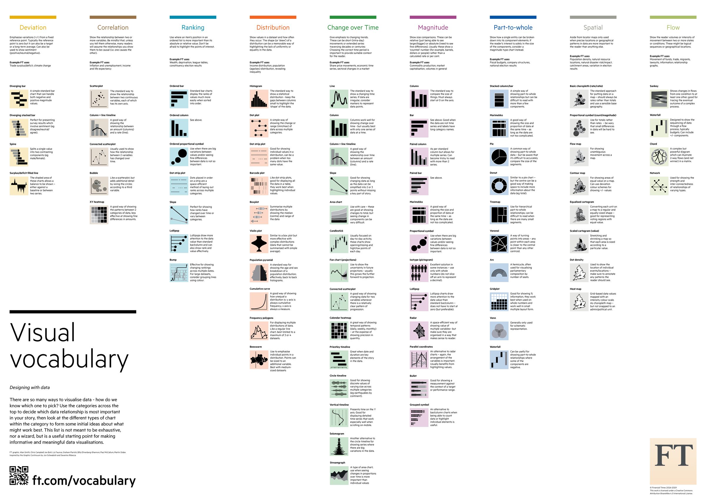
There are loads of chart types on there that I think are really interesting, and I’ll probably want to use them in the future. So I built my own mini tool. I’d already had an agent redraw every chart in tldraw. This time I wanted it as a web page I could give to other agents:
recreate each of the charts on https://github.com/Financial-Times/chart-doctor/blob/main/visual-vocabulary/poster.png in one html file, in javascript and svg only, no libraries. group them the same way the poster does. i'm going to give this page to other agents whenever they need to make a chart, so keep the code for each chart simple and easy to copy. use subagents to parallelise work where possible.
Now I can give this page to any agent that needs to make a chart. A lot of the time I get the agent to use the poster to work out the best way to show something. Other times I ask for a specific chart type myself, like an XY heatmap.
A few places the ideas on this page came from:
- The Puddingvisual essays made out of data. the style I asked for before the cups
- Riley Walzsites built on live public data, like where San Francisco’s buses are. where Realtime Tokens started
- Visual Vocabulary Financial Timesthe chart types above, with examples of each and when to use them
Notes
- Scrape what’s hard to get: council spending from 319 councils, flattened into one table.
- Keep it up to date by scraping again on a schedule: Realtime Tokens every five minutes, my tokens every hour.
- Look at it another way: my spending as coffee cups instead of tables and bars.
- Make a lot of it simple: every Ben’s Bites issue on a timeline, like the Wayback Machine.
- I don’t have a repeatable process yet. I use the FT’s Visual Vocabulary to pick a chart, and I gave it to my agents.